Monday, November 10, 2014

The Notebook Stopmotion (A.K.A Still Frames Go In, Video Comes Out)

A normal scene.
Kopf has been set aside for the moment, as my new focus is on a group stopmotion project. I was placed with a group of 5 other students with the task of creating an animation incorporating stopmotion in some form. My group decided to fuse together three different styles: live-action, stopmotion, and 2D computer animation. The story focuses around three objects that come alive when their owner leaves the room: a highlighter, a sticky-note pad, and a staple-eater. They fall notebook and transported to a doodle world, which they then explore and try to escape from. It ends with them successfully escaping and rejoicing before the owner returns and everything returns to reality.

Pre-Production

In order to create this, we had to compromise and combine parts of our own individual ideas. We had each come up with our own plan and concept, so we had a communal session and included the aspects that we found most interesting/practical. We combined our interests (including my fascination with googly eyes) to decide on the premise: a bunch of office supplies going on an adventure in an alternate dimension. We then created a storyboard for the whole thing, took a few rough shots to determine which angles would work best, and created an animated storyboard with scene timings that we agreed on.

Production

The actual shooting was rather painful, as stopmotion is apt to be. We carefully moved the objects a slight amount each frame to simulate motion, and then compiled them all in After Effects. We also took the live-action shots and compiled them, as well. The doodle world animators worked in Photoshop and After Effects, creating a black-and-white world inside of the notebook that was rendered out and combined with the stopmotion and live-action during compilation.


                                               Post-Production

An abnormal scene.
For the post-production phase, we looked at all of the shots we took and made edits to the exposure, gamma correction, and color curves to make each shot look as close to the others as possible (since we had to shoot in a dynamic environment, there was variations in lighting that needed to be fixed). We also checked through the footage and extended a few frames to make the animation smoother (for example, when the notepad stands up on the highlighter). The doodle world animators also put the finishing touches on their segments.


 Reflections

During this project, I learned how to better operate and set up cameras due to the importance of the angles and perspective in the shooting process. I also learned how to sequence frames in After Effects by using a Time Stretch and a Sequencer script (which is incredibly convenient). I also developed a better idea of the group planning process, and how to compromise with ideas and create goals and deadlines.

After the great escape.
If I were to do this project again, then I would definitely pick a more stable shooting environment. It wasn't until fairly late into the shooting process that the flaws became evident, but there is noticeable shadow movement in some shots. There was also the issue of inconsistent lighting, which could be controlled in a more stable area. I would definitely use the same planning process though, as the storyboarding and creation of an animated storyboard with scene timings helped A LOT.

This project definitely helped to develop my thinking regarding pre-production planning, as well as indicating the necessity of a controlled shooting environment. Even though there are some noticeable flubs so far, I still don't think it looks too bad considering the fact that it was some of our first times doing it. If nothing else, at least the doodle world is pretty cool. The animated storyboard and regular storyboards are below. Some other shots are below as well, so feel free to take a look.


Why yes, that is a conga line.
Buddies 4 Lyfe.


Part 1
Part 2

Part 3
This is one of our early drafts of the project. We compiled all of the frames and video and added sound effects and a background song. Yes, the background song is elevator music. (We were running out of time until the deadline.) There were still some edits to be made, mostly involving light and color correction and small edits to sound effects, but this was pretty close to a final product that I wouldn't feel bad about showing.


This is our final edit. We added some more color and lighting correction and some changes to sound (such as a new, zipping sound when they get taken into the notebook, a non-copyrighted alert sound, and better synchronization with the video). We also added an intro and some credits.

You can read my other group members' posts by following these links:


Wednesday, October 1, 2014

The Perils of Waiting Until the Last Day to Render Things (aka This Project in Retrospect)

As I said in the previous post, I had to render out my final rotation using the Maya Software instead of mental ray, hence the rather sketchy looking video. I have discovered that it actually does render out in mental ray, it just takes forever and makes it possible to roast marshmallows over the heat vents. At any rate, I will get it rendered out with mental ray. Until then, you will have to settle with this:


Sorry it's a bit underwhelming. At any rate, I'll use this to discuss faults I have with the final project:

The skinning still is pretty flawed in his mid-section, which I am still attempting to find a plug-in to fix.

Some topography around his armpits and near the corners of his mouth is pretty sketchy; there are a few wavy edges that I would like to fix.

I still need to find a good setting for the amount of photons, so that it will stop displaying those circles on the ground when I render with mental ray.

The skinning is by far the worst issue, though, and the other two are fairly minor. Overall, I am very happy with how this project turned out, given how it was my first time really trying to do something entirely on my own in Maya. Once I iron out the kinks, I think I will try to make an animation with Kopf (I would like to try to animate him next quarter, but I am still considering other options/ my inherent idiocy at using the software).

No matter what I decide, I'll find another project to do next quarter. I'll also probably post a blog after I fix (or at the very least attempt to fix) the issues I discussed after I fix them.

~~~~~~~~~~~~~~~~~~~~~~~~~~~~~~~~~~~~~~~~~~~~~~~~~~~~~~~~~~~~~~~~~~~~~~~~~~~~~~~~~~~~~~~~~

Edit: I have now successfully rendered it out in mental ray (WOOHOO). Here is the final result:


He looks much, MUCH better when he actually has decent lighting on him. Something I realized that I haven't really addressed was my rationale behind creating Kopf the way I created him. I wanted to make a comical, cartoony character, but wasn't sure exactly what to make. I ended up seeing an Easter Island head during a Google image search, so I decided at that point to make something with a human body and an Easter Island head. I ended up dropping the human body idea, and creating a more exaggerated buff upper body with dinky little legs. I at first wanted to put him in a suit, but made a separate body model and separate clothing models, which resulted in problems when I began rigging him. Therefore, he runs around naked now. Once I had my idea, I started watching Lynda tutorials and applied what I saw to my own character.

Honestly, I found the most fun aspect of this process to be the lighting and rendering. Even though it takes forever to render and check your progress, watching the scene go from flat and colorless to deep and vibrant is kind of fun. I also think the lighting was the best part of this scene, because there are a few issues with the model and rig that I still need to work out.

During the class critique, the largest criticism I got was that the camera rotated too fast for a character demonstration. This is easily fixable, and it's really just an issue I overlooked in my haste. People actually liked the circles that resulted from a lack of photons, so I may keep them. When I re-render it with better camera motion (and possibly without circles), I will make yet another edit to this post with the final product.

Finally, I supposed I should cover what exactly I learned through this process. I learned how to model characters (and the fact that it involves a butt-ton of extruding, edge loops, and sculpting) and how to rig characters (with a skeleton/joints, IK/FK handles, and constraints), and how to render with global illumination in mental ray (WOOHOO INDIRECT LIGHTING). I already kind of sort of knew the basics of shading and lighting, but this also served as a good refresher on those. The biggest issue I had was weighting the skin of my character, since the fine-tuning takes FOREVER. If I had to redo something, I would probably redo the modelling process, since there were a few areas with really sketchy edge loops that I could have fixed by putting off the smoothing process until I had more basic topography done. Overall, though, apart from the skin weighting, I am rather proud of this project. For my first foray into character modeling, I believe I put forth a worthy effort.

Project Weeks 5/6: Lighting and Rendering

Even though I promised to make two different blogs for the lighting and the rendering, they really kind of go hand in hand, so I'm going to condense them into this single post.

Lighting is the process of adding lights to the scene (imagine that). I used a modified three point lighting system, which involved placing a point light, two fill lights, and a back light. The point, or main, light is in front of and slightly above Kopf, and is shining down and casting a shadow behind him. It is the only of the 4 lights to emit diffuse and specular. My two fill lights are located on Kopf's sides, and help to make the shadows on his body less intense so as not to obscure detail. The back light is directly behind Kopf and shines forward to help him stand out more against the background and add depth.

I then added a simple camera, placed its pivot point inside of Kopf around his mid-section, and set the camera to rotate 360 degrees around him over a span of 120 frames (about 5 seconds).
My lights from the back, showing the point light furthest away, the back light closest, and the fill lights in between

I attempted to render out in mental ray, a plugin which using raytracing to simulate natural light. However, given how OS X Mavericks seems to hate mental ray (and Maya in general), I was not able to batch render out my full rotation. I did, however, get this pretty sweet still shot.

He looks pretty nice when his spine isn't wrapping around itself
I used an additional setting in mental ray called global illumination to help with indirect bounce lighting, which is why you can see the tinge of red from the floor shining onto his lower body. However, this also created the issue of the red circles on the floor. The circles are created when the amount of photons being cast by a light are too small to accurately bounce light off of an area, but the Mac was already about to catch fire while rendering it, so I couldn't really push it further.

You may be asking: Where is the final rotation? Well, it's coming in the next post, where I will summarize my experience and point out areas that I still need to work on. It won't initially be rendered in mental ray, but I will find some way to get that done later. It will instead be in the (rather disappointing looking) Maya Software.

Wednesday, September 24, 2014

Project Week 4: Character Shading

As promised, here is the next update (this time only half a week late!). Shading took much less time than rigging, simply because there is much less work involved in the process.

Shading is just the process of creating the texture and color on your model. Given how lambert1 is rarely the most enthralling shader, I had to create a new shader, add a bump map to that shader, and then attach the shader to my character using a UV map.

At first, I created a Blinn shader, since I prefer working with Blinn (I think they display bump maps better, but that is mostly opinion). I then just altered the color to make it more stone-like, and changed the specular settings so that the reflections and eccentricity would not reflect much light.

Shader settings

After that, I added a bump map to create texture, so that Kopf actually looks like he's made out of rock instead of clay. I used a fractal bump map to make the texture kind of random, but still coherent, and set the bump value fairly low since the Easter Island heads are actually pretty smooth.

Fractal settings

Bump map settings

The final step involved mapping to shader to my character using UVs. Although the color applied itself without a UV map, bump maps cannot be applied without them. All I did was use the Automatic Projection tool, since I didn't have to worry lining up UV shells due to the fact that the shader was just a constant color. I had considered using a seamless rock image to make him actually look like stone, but the UV map was just too complicated to fix within my limited timeframe.

Model with shader

Overall, the result was pretty good. I may still alter the shader or bump map after I add lighting and start rendering, but this is a pretty decent start.


Friday, September 19, 2014

Project Week 3: Character Rigging

First off: I am a week behind at this point. Rigging is very, very difficult, and takes a REALLY LONG TIME. I'm still not even done, but I'll elaborate on that later on.

Rigging is, in a nutshell, the process of creating a manipulable skeletal system and control system, and then attaching that skeleton and system to the model. Creating the actual skeleton is as simple as tracing the outline of a skeleton (foot, ankle, knee, hips, spine, clavicle, shoulder, elbow, wrist, fingers, and neck are my major joints) with the Joint tool, and creating IK handles which make the skeleton move realistically when certain joints are moved (for example, the knees bend when you duck the hips down).

Creating the control panel is much more difficult. Using constraints to make joints move and rotate or track NURBS curves is basically all that you're doing, but keeping a clean hierarchy can be a puzzle at times. I used position constraints for things that would move like the feet and hips, orient constraints for things that would rotate like spine joints and wrists, and pole vector constraints for things that would bend in unique ways, like elbows and knees.

Attaching the skeleton and control panel to the skin is similarly difficult. Using the Smooth Bind tool, Maya will do a basic (read: pretty awful) job of making the model move with the skeleton. After smooth skinning it, you have to check the influence certain joints have on different areas of the skin, to make sure that joints aren't moving more than they should be (so that your chest doesn't cave in when you push the elbow closer to the body). Painting the skin weights manually takes FOREVER, so I am currently attempting to find a plug-in to assist with the process. (I'll include a link to the plug-in if I find one in an edit.)

So, here are the results of my labor:

Skeleton and control panel with transparent model

Skeleton and control panel sans model

I don't think wrists bend that way

DEAR GOD MAN GET THAT LOOKED AT
As you can see, I'm not entirely done yet. There's still some things to clean up, like overlapping wrist skin and that gaping crater in his chest that happens when he leans back. But that will all be allayed at a later date when I'm polishing, the brunt of the work is mostly over. Now, I get to begin shading the model. Given how I am horrendously backed up, I will work tirelessly over the weekend to catch up, and will attempt to get the next post up by next Wednesday.

Wish me luck. I will sincerely need it.

Monday, September 8, 2014

Project Week 2: Character Modeling

So I kind of sort of missed updating the blog last Friday because I was working until 5 o' clock on finishing Kopf's (which is his name, I have now decided) clothing. I apologize for the delay, but character modeling takes A REALLY LONG TIME, especially if you only have a cursory knowledge over the matter.

In a nutshell, all I did was extrude and match vertices and faces into the reference images from an initial polygon plane, and then fine tuned from there (AND THIS TAKES FOREVER). I used the Insert Edge Loop and Multi-Cut tools to create topography to add more edges and vertices to modify in greater detail. I created a separate head and body and connected their vertices with the Merge Vertex tool to create a neck (same thing with the hands/wrist). To create clothing, I just duplicated the body, deleted faces I didn't need, and used the Sculpt Geometry tool to pull the faces outward to create the different articles of clothing. Here are a few renders of the initial pieces, and one of them compiled.
The body
The head
The hand, after connection to wrist
Entire body, smoothed and connected

Body with clothes (the shaders are pretty sketchy at this point)
Again, sorry for the delay. But I overestimated my ability to actually be good at using Maya.

Friday, August 29, 2014

Project Week 1: Reference Images

After many nights of slaving over computer screens, trying to discover the intricacies of the human body and the Easter Island head, I came up with these (rather horrible) reference images:

There is a reason why I am in Animation instead of Drawing.


As you can see, they aren't the greatest. Their purpose is to give me a decent foundation to build the beginning of the character, which they will try their hardest to do. Once I get the foundation down, I can modify it free-form to make it look good.

I have more information pertaining to my character: he is an alien scout that landed on Easter Island and began to take the shape of the denizens he saw: the heads of the Moai statues and the bodies of rich corporate executives on vacation. He isn't actually wearing a suit, it's his skin. He has a larger upper section than lower section, relatively stubby legs, and hands with only 3 fingers. Why does he only have 3 fingers? Because hands are REALLY hard to draw.

I will post more next Friday, after I hopefully have his model finished.

Friday, August 22, 2014

First Quarter Project Planning

As a junior in e-Comm, the time has come for me to begin my first project.  As my first post regarding it, this will include my outline that I will follow.

My idea for the project is to model and rig a character in Maya, in addition to some basic lighting and rendering in mental ray. I do not plan on texturing the character, as I am afraid time constraints would limit my ability to do so.  At this point, I believe the character will be an Easter Island head with a normally proportioned human body wearing a suit.  Provided below are some images that inspired that idea, as well as my outline and schedule for the project.

(Images from learningthenow.com)

Character Reference Drawing (Due Friday, August 29th)
Create a reference image of the body and head of character (2 hrs)
Include top, side, and front view (2~3 hrs)
Blog: All of the reference images

Character Modeling (Due Friday, September 5th)
Watch Lynda Playlist: "Modeling a Character in Maya" (Done)
Create head (~1.5 hrs)
Create body/clothing (2 hrs)
Create hands (1 hr)
Blog: Simple renders of the individual parts


Character Rigging (Due Friday, September 12th)
Watch Lynda Playlist: "Character Rigging in Maya" (~5 hrs)
Create body skeleton (1.5 hrs)
Create facial skeleton (1.5 hrs)
Blog: Images of the skeleton system

Character Shading (Due Friday, September 19th)
Watch Lynda Playlist: "Creating Textures and Shaders in Maya" (~4 hrs)
Create shader for skin
Create shader for clothing
Blog: Images of model with shaders

Lighting (Due Friday, September 26th)
Watch Lynda Playlist: "Lighting and Rendering in mental ray" (5 hrs)
Set up lights (3~4 hrs)
Blog: Various renders of lighting

Mental ray Render (Due Wednesday, October 1st)
Create a few test renders (~2 hrs)
Final render (~1 hr)
Blog: Test setting renders, final render

Friday, April 25, 2014

Chronicling the Creation of Some Volumetric Light

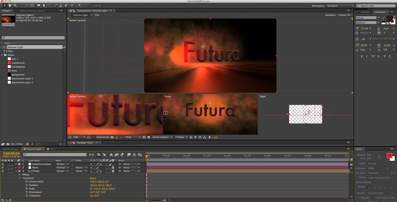
    Recently, I created an introduction sequence of sorts with 3D volumetric lighting in After Effects by using a tutorial from Video Copilot (you can find the tutorial here).  It was a fairly simple project, primarily focusing on using adjustment layers to modify the composition and using null objects being tracked by lights to create the illusion of 3D lighting.  I'm quite happy with the end result, which you can find at the bottom of this post if you don't feel like reading my ramblings on the creative process.

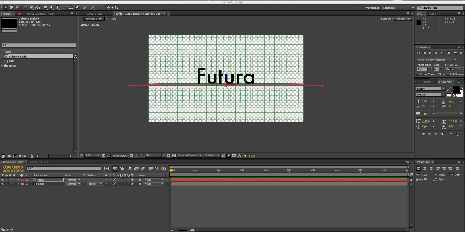
     This is how I began my project.  A simple pre-composed text layer containing my spirit font, Futura, and a grey solid to represent the floor.  I changed them to 3D objects so I could rotate them, and then added a 2D black solid background.


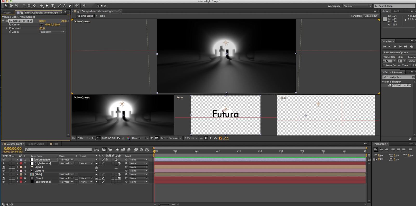
    After that, I added a point light and a null object, and set the light to track the null object, which let me control how the light shined through the letters.  I then made a white solid and used the ellipse tool to cut a circle out, and created an adjustment layer with the CC Fast Blur effect to create the blurring around the light source.

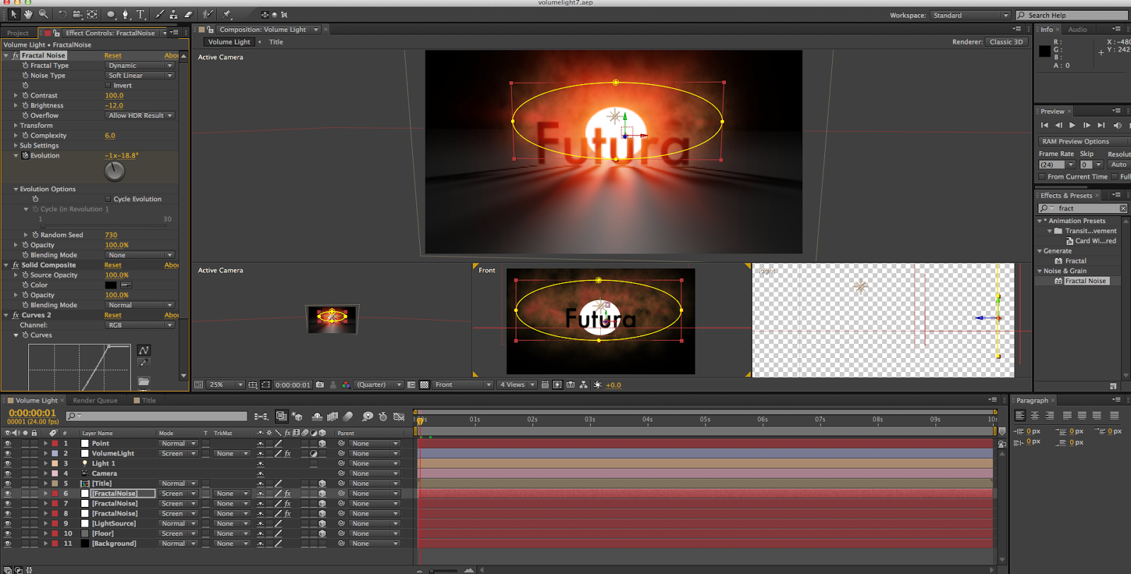
    I then added some "smoke" to the scene by creating some solids with a Fractal Noise effect on them, making an ellipse, creating a Solid Composite effect on the layer, and setting it to the Screen blending mode.  I also set the floor and light to the Screen blending mode, so that they would all be visible even if they were laying on top of each other.  I also began to play with color curves at this point, giving the smoke and light a slight reddish-orange tint.  I then duplicated the smoke layer twice more and gave them each a different size and distance from the camera.

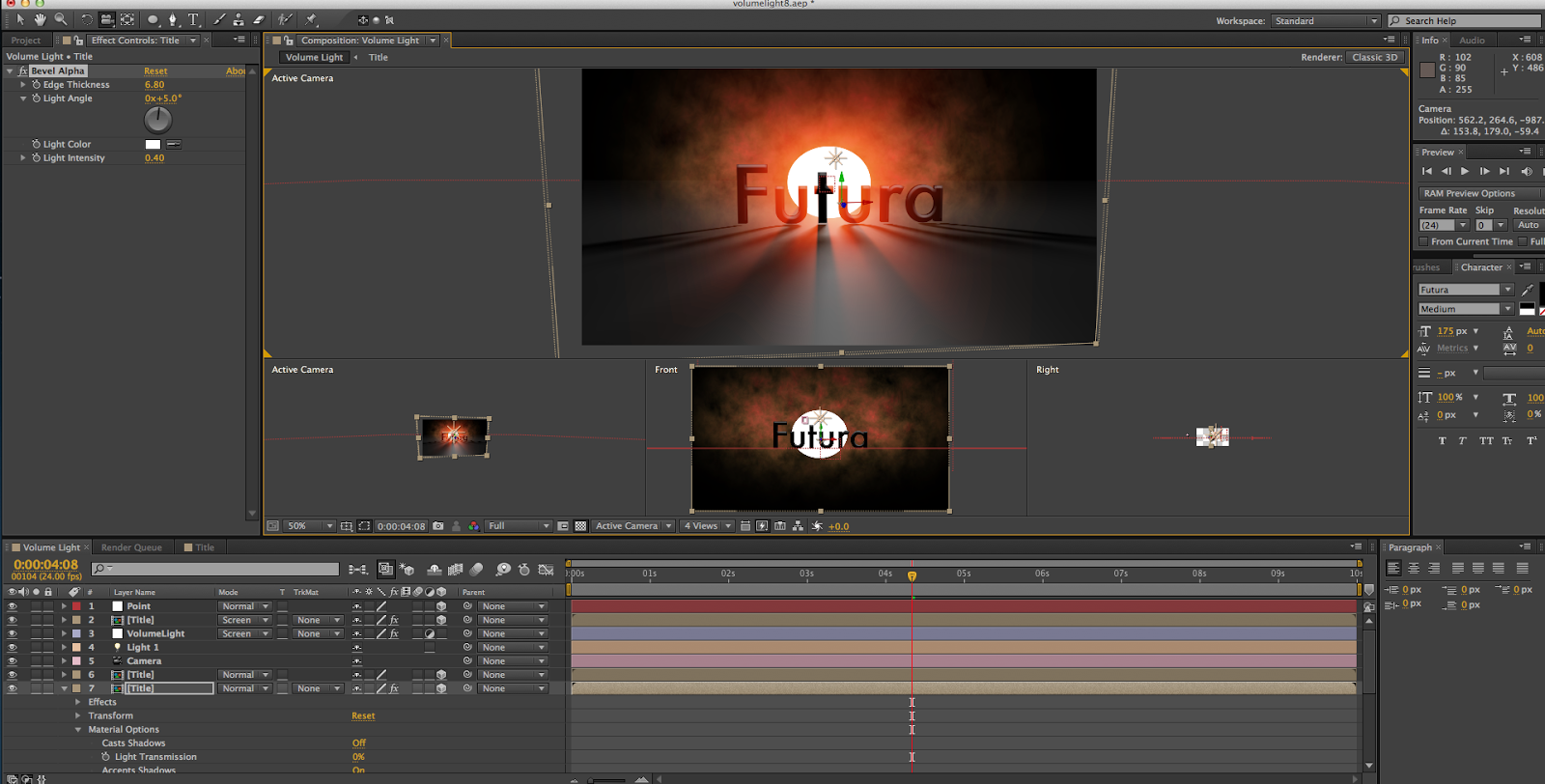
     Though it's hard to tell due to the small image size on this post, I then duplicated the text layer twice and gave them a Bevel Alpha effect to create more depth.  I also began to give the smoke clouds some animation, keyframing the evolution of them so that they would swirl around in the background.

    After all of this, it was mostly just polishing.  I continued to play with the color correction, giving the scene a deeper, more orange hue.  I also changed the mask feathering on the light source, so that it blended into the smoke clouds, rather than being like a large spotlight shining through.  I also added a camera rotation to the scene, to show how the light shines through the letters at different angles.  After that, I rendered it out and felt awfully good about myself.


    All in all, I really enjoyed this project.  I definitely enjoyed learning about 3D lighting in After Effects, and I also learned more about how adjustment layers work.  (Also, I indirectly found out how to make a decent smoke cloud.  So score on that, as well.)  I think the hardest part of the tutorial was just playing around the the smoke clouds and light source to get them to look well together, because the actual lighting aspect was fairly easy.  My favorite part was working on the Fractal Noise effect, trying to find a good smoky look for it.  I feel as though the settings I ended up with look pretty good, if I do say so myself.  I'm very happy with my final product, with my only major complaint being that it looks like the type is floating above the floor.  However, I couldn't fix that without changing the font, and given how I love Futura that was not an option.  Still, that's a pretty minor issue, and I still enjoy the end result.

Tuesday, April 1, 2014

Responsive Web Design

    Responsive web design is the practice of making websites that are easy to view across all devices, be it tablets, desktops, or phones.  This is important because it reduces the cost to maintaining only one site (instead of separate mobile and desktop sites), because of the rising use of mobile devices, and because it enhances user experience.  Responsive web design can be achieved through use of media queries, CSS declarations that can alter the style sheet based on the device being used to view it.  One aspect of these media queries are breakpoints, which change the layout once a certain browser width has been reached.  For an example of responsive web design, I found the Boston Globe's website (http://www.bostonglobe.com/).


    This is the main page displayed on a desktop monitor.  The font and images are large, and there's even an ad in the upper right.  The navigation bar at the top covers all the categories of the paper in addition to a search bar.  There are three main columns, one for major stories to the left, another for smaller stories to the right, and one for the ad and tweets from their Twitter on the right.  The content spans across the entire page, and it makes use of all of the space it has.


    This is the main page displaying as it would on a tablet.  Notice how the entire right column with the ad and tweets has been removed to save space.  Only the columns with stories remain.  The font and images are smaller, but still easily readable, and are the main focus of the smaller view.  The navigation bar has been reduced to only three main tabs with sub-tabs and the search bar to save screen space.  The main focus of the content is still the stories, but it is made even more evident in this view due to the lack of the right column.


    This is the main page displaying as it would on a mobile phone.  At this point, due to the lack of screen space, there is only one column with the major stories.  The text and images have been shrunk quite a bit, but are still readable (maybe with a BIT of work).  The navigation bar has been condensed even further, with only two main tabs and the search bar becoming a button that you need to push, rather than a text field.  The main content (and pretty much the only content) on this page are the main stories, which are the primary focus of the site.  As such, even though the layout is much smaller, the point of the site still manages to be put across.

Thursday, March 27, 2014

The Plausible Impossible


      There are many examples of the plausible impossible throughout Disney's work, but the clip showing Donald's rather hungry cousin Gus Goose visiting is absolutely rife with them.  Below are 5 examples from the clip, with explanations covering the plausibility, yet impossibility of the events shown.

Gus showing some corn who's boss
      In this example, we see Gus devouring some corn in a manner similar to typing on a typewriter (with accompanying sound effects).  This is plausible in that Gus is clearly a master in the art of eating, with this being his preferred method of dispatching corn.  Although, even if he could destroy that corn with such speed, it most definitely wouldn't make such a sound effect.  This is the cartoon world, however, and sound effects seem to accompany everything without anybody being alarmed.  So, even though in our world this would be quite a sight, in the cartoon world it's simply common nature.

Gus showing some coffee who's boss
     In this example, we see Gus absorbing coffee through bread not unlike mercury rising through a thermometer (also with accompanying sound effects).  This is plausible in that bread is absorbent in reality.  However, bread most definitely does not absorb liquids in such a manner, and (again) it definitely doesn't have sound effects.  Again, though, the cartoon world has it's own set of rules, so liquids operate differently.  If it wants to go straight up through a loaf of bread, then it will go straight up through a loaf of bread.

Gus showing some peas who's boss
      In this example, we see Gus luring a battalion of peas across the dining room table into his mouth, by inhaling very deeply through a straw.  This is plausible in that sucking through a straw will generate suction which will pull things closer.  However, the necessary suction needed to attract the peas from across a table would be far higher than your everyday goose could manage.  In addition, they would not be able to curve and veer wildly like a snake slithering about.  But, in the cartoon world inanimate objects can inherit animate qualities at the drop of a hat.  Peas being pulled across a table in an elaborate routine is child's play.

Gus showing a sandwich who's boss
      In this example, we see Gus shortly after he completely obliterated a gargantuan sandwich by shuffling it into his mouth like a deck of cards.  This is plausible in that a suitable amount of food being shoved down your throat at once will have a difficult time finding its way down your windpipe.  However, it most definitely would not extend your throat like an accordion (with even more accompanying sound effects) until your gulp it down.  (You would just choke to death, which is far from the most noble of deaths.)  This is (yet again) a cartoon, though, and that food will take its sweet time traveling to your stomach until you urge it along.  What would normally be a horribly undignified demise is changed to a comical moment due to this abandonment of the laws of nature.
Gus showing some spaghetti who's boss
      In this example, we see Gus masterfully knitting spaghetti into a sock before ending its noodle-y existence.  This is plausible in that spaghetti is very yarn-like, being very thin and stringy.  However, in reality, spaghetti would be a horrible knitting material, as it is far too weak and is not capable of being pulled tightly together (though I cannot speak from experience, this is purely theory).  In his cartoon existence, though, Gus is more than capable of weaving socks better than your grandmother using incredibly impractical material.  Anything can be used to make anything, as long as you put the right spin on it.

Tuesday, February 11, 2014

Illustrator Web Design Part 2 - Return of the Vector

     I searched and found two very nice looking vector-based web designs, the ones at http://www.mobilestatistics.com and http://www.digitalpodge.co.uk/2009/.  The first is for a website that points out many statistics about the sale of mobile phones (especially smartphones) and portrays them in entertaining little graphs.  I like the grid design of the site, and I like the cooler, tamer colors in the background.  The colors, along with the solid looking font, achieve the look of a graph very well.  The site being made in Illustrator helps it have its "crisp", clean appearance, no matter how large the browser window is.  The second site is for an annual meeting of designers in Britain.  I like its simple, structured design which seems very clear.  The cell-based design of the homepage makes it look organized, and the colors mesh very well together.  Again, Illustrator contributes to it having its  smooth and clean appearance.

Wednesday, February 5, 2014

Illustrator Web Design

    Illustrator seems to be very useful for web design, as it allows you to save elements, edit what you've already created, and optimize your workspace.  If you set the color mode to RGB, disable the artboard and page tiling, and place a web browser window that has been emptied in Photoshop, you can use that as a canvas to design on.  You can set everything to pixels and set the keyboard increment to .5 px, which can be used to fix blurriness on lines and sharp objects.  You can save master symbols used for the GUI and design to edit later, and can create entire new symbol libraries.  You can do the same with textures and swatches, as well.  Because of how vector graphics work, you can edit what you have already placed very easily, whereas in Photoshop such a process could be quite difficult.  You can format and wrap text very easily using Illustrator, and also use paragraph and character styles to further modify text.  Illustrator also lets you customize your workspace, which can speed up the design process.