Recently, I created an introduction sequence of sorts with 3D volumetric lighting in After Effects by using a tutorial from Video Copilot (you can find the tutorial
here). It was a fairly simple project, primarily focusing on using adjustment layers to modify the composition and using null objects being tracked by lights to create the illusion of 3D lighting. I'm quite happy with the end result, which you can find at the bottom of this post if you don't feel like reading my ramblings on the creative process.
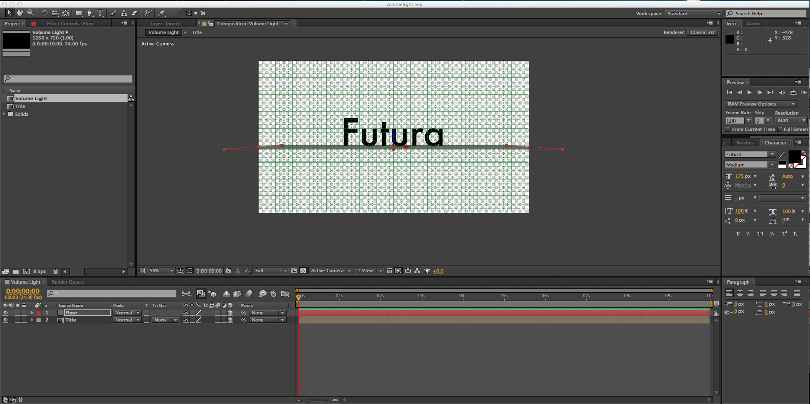
This is how I began my project. A simple pre-composed text layer containing my spirit font, Futura, and a grey solid to represent the floor. I changed them to 3D objects so I could rotate them, and then added a 2D black solid background.
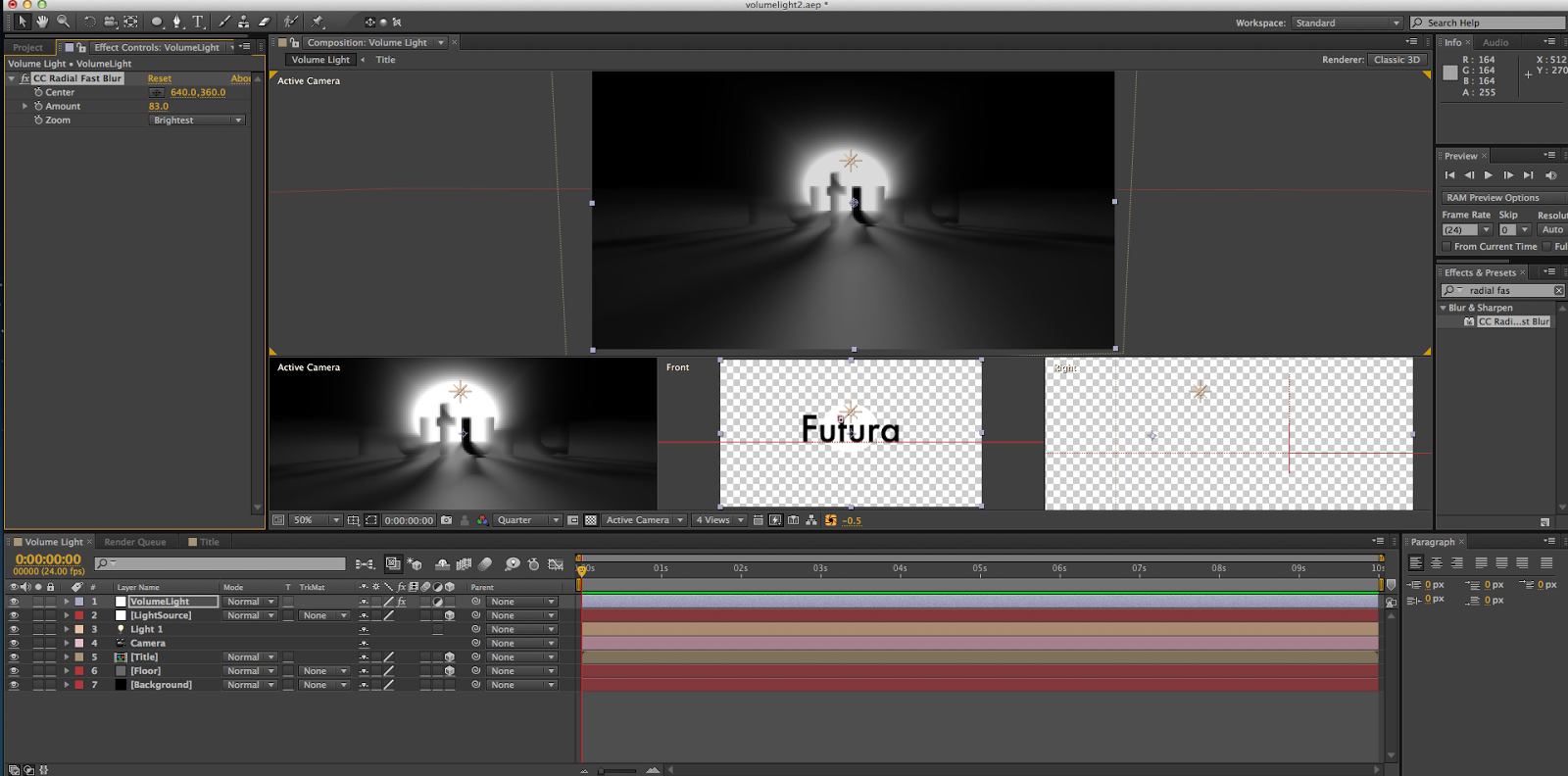
After that, I added a point light and a null object, and set the light to track the null object, which let me control how the light shined through the letters. I then made a white solid and used the ellipse tool to cut a circle out, and created an adjustment layer with the CC Fast Blur effect to create the blurring around the light source.
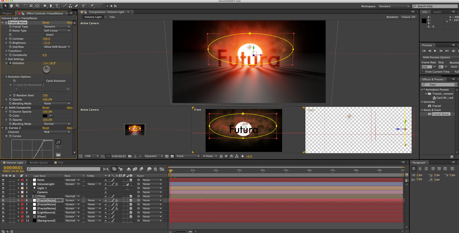
I then added some "smoke" to the scene by creating some solids with a Fractal Noise effect on them, making an ellipse, creating a Solid Composite effect on the layer, and setting it to the Screen blending mode. I also set the floor and light to the Screen blending mode, so that they would all be visible even if they were laying on top of each other. I also began to play with color curves at this point, giving the smoke and light a slight reddish-orange tint. I then duplicated the smoke layer twice more and gave them each a different size and distance from the camera.
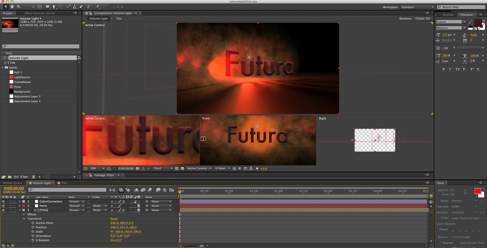
Though it's hard to tell due to the small image size on this post, I then duplicated the text layer twice and gave them a Bevel Alpha effect to create more depth. I also began to give the smoke clouds some animation, keyframing the evolution of them so that they would swirl around in the background.
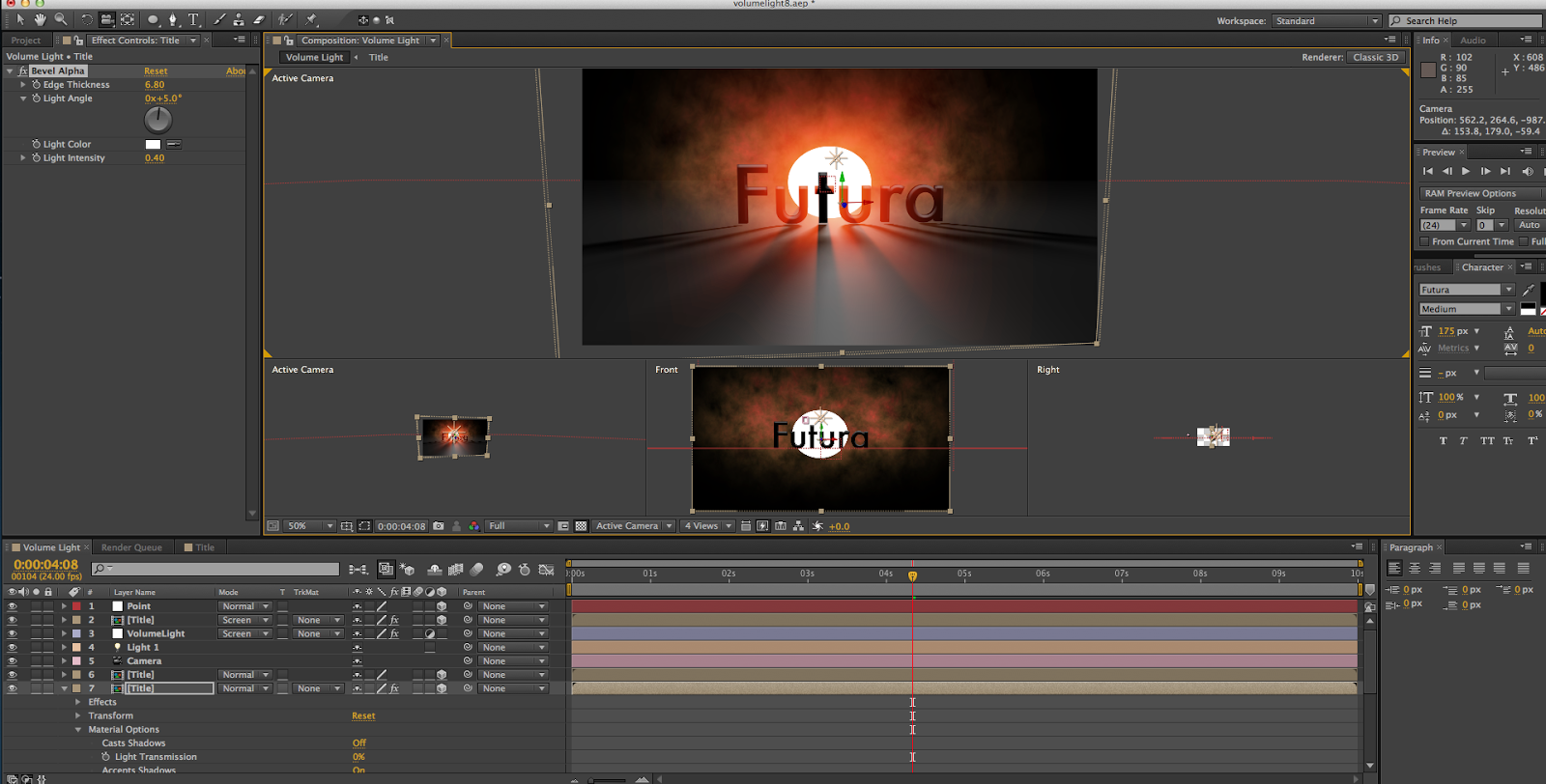
After all of this, it was mostly just polishing. I continued to play with the color correction, giving the scene a deeper, more orange hue. I also changed the mask feathering on the light source, so that it blended into the smoke clouds, rather than being like a large spotlight shining through. I also added a camera rotation to the scene, to show how the light shines through the letters at different angles. After that, I rendered it out and felt awfully good about myself.
All in all, I really enjoyed this project. I definitely enjoyed learning about 3D lighting in After Effects, and I also learned more about how adjustment layers work. (Also, I indirectly found out how to make a decent smoke cloud. So score on that, as well.) I think the hardest part of the tutorial was just playing around the the smoke clouds and light source to get them to look well together, because the actual lighting aspect was fairly easy. My favorite part was working on the Fractal Noise effect, trying to find a good smoky look for it. I feel as though the settings I ended up with look pretty good, if I do say so myself. I'm very happy with my final product, with my only major complaint being that it looks like the type is floating above the floor. However, I couldn't fix that without changing the font, and given how I love Futura that was not an option. Still, that's a pretty minor issue, and I still enjoy the end result.


